
Show these metrics on every loan officer dashboard: funded loans, funded volume, applications, pull-through rate, average days to close, cost per loan, pipeline by stage, and loans per LO. Check pipeline stage and stalled files daily, applications and pull-through weekly, and funded volume, cost per loan, and productivity monthly. Use consistent definitions and lean on industry benchmarks from organizations like the MBA, not gut feel, to know what good looks like.
TL;DR:
- Loan officers and managers should monitor funded loans, funded volume, and cost per loan regularly, with funded volume and cost tracked monthly to account for market fluctuations.
- The pull-through rate and days to close require weekly review to identify operational issues early, with flags for files stuck over 10 days to prevent workflow bottlenecks.
- Benchmark goals such as 30 to 50 days to close and 3 to 5 loans per month per officer should be adjusted for product type and market conditions, not treated as fixed targets.
- Accurate, consistent definitions and integrated data sources are essential to ensure reliable metrics, avoiding misinterpretations caused by duplicate records or stage mismatches.
- Dashboards should be customized for individual and team goals, focusing on actionable indicators like stalled files and pipeline risks, supported by automated alerts and regular data refreshes.
Table of Contents
- Practical use cases for a loan officer dashboard
- Core loan officer metrics: definitions, formulas, and where they belong
- How to measure and visualize each metric on a dashboard
- Benchmarks and target ranges lenders commonly use
- Data definitions, governance, and common pitfalls
- Practical dashboard layouts and tiles worth building
- Author perspective: practitioner tips from Omar Khamisa
- KPIs specific to different loan types or channels
- Benchmark comparisons against industry standards
- How to customize dashboards to individual or team goals
- Common pitfalls or misinterpretations of dashboard metrics
- Examples of actionable insights derived from dashboard data
- Integration of loan officer dashboards with other CRM or lending systems
- What the data actually says about dashboard metrics
- How an integrated mortgage platform can centralize these metrics
- Sources
- FAQ
Practical use cases for a loan officer dashboard
A dashboard earns its place on a screen when it answers a real question fast. Managers use it to spot which loan originators are worth recruiting harder, which files are about to die in underwriting, and who deserves a raise or a coaching conversation. Loan officers use the same numbers to decide where to spend the next hour.
- Recruiting and profiling: compare production history and pull-through before extending an offer.
- Daily triage: surface stalled files before borrowers start calling about delays.
- Performance reviews: tie compensation conversations to funded volume and conversion, not anecdotes.
- Capacity planning: set staffing ratios based on loans per LO and processor load.
- Quality control: flag pattern errors, like a channel with unusually high denial rates, before compliance finds them first.
Core loan officer metrics: definitions, formulas, and where they belong
Every dashboard tile needs a precise definition behind it, or two managers will argue about numbers that should not be debatable.
- Funded loans (count): total loans that reached funding in a given period. Formula: count of loans with funded status inside the date range. This is the primary production tile, shown as a single number with a trend line against the prior period.
- Funded volume ($): total dollar amount funded. It drives compensation and helps prioritize which files get senior underwriter attention when capacity is tight.
- Applications and the conversion funnel: track applications per LO, then show the funnel from application to approval to clear-to-close to funded. A funnel chart, not a table, makes the drop-off points visible at a glance.
- Pull-through rate: the share of applications that reach funding. A falling pull-through rate usually points to pricing misses, documentation problems, or a channel with weaker borrower quality, and it deserves a quick audit of declined and withdrawn files before you assume the sales team is underperforming.
- Average days to close: typical cycle time runs 30 to 50 days, and anything stretching past 50 is a workflow flag worth investigating, according to Chase.
- Cost per loan: total production expense divided by funded loans, broken into personnel, back-end operations, and compliance drivers.
- Loans per LO: a core productivity benchmark, discussed in detail below.
In 2022, average production costs climbed to roughly $10,624 per loan, a reminder that cost-per-loan tiles need year-over-year context, not a single snapshot.
How to measure and visualize each metric on a dashboard
The right aggregation window matters as much as the metric itself. Pipeline health needs daily eyes. Application flow and pull-through move slowly enough for a weekly check. Funded volume, cost per loan, and productivity make more sense as monthly or year-to-date views, since they smooth out the noise of any single week.
- Use single-number tiles for funded loans, funded volume, and cost per loan.
- Use trend lines for pull-through rate and days to close so drift is visible early.
- Use a funnel chart for the application-to-funded conversion path.
- Use an aging heatmap to show how long each file has sat in its current stage.
- Filter every view by loan officer, branch, product, channel, and time period so a manager can isolate the source of a problem.
Pro Tip: Set an automatic flag on any file sitting more than 10 days in the same stage, so stalled loans surface without anyone having to go looking for them.
Benchmarks and target ranges lenders commonly use
Dashboards mean nothing without a target to measure against. Days to close should sit between 30 and 50 days, with anything longer flagged for review. Loans per LO typically averages a moderate number per month, with top performers reaching notably higher amounts.
Production costs rose to about $10,624 per loan in 2022, while productivity fell to roughly 1.5 loans per production employee per month, a sharp reminder that profitability and productivity swing hard with the market.
- Treat benchmarks as multi-year ranges, not fixed targets, since volume cycles up and down with rates.
- Segment targets by product and channel before comparing one team to another.
- Revisit cost-per-loan targets whenever staffing or compliance requirements shift.
Data definitions, governance, and common pitfalls
A dashboard is only as trustworthy as the definitions behind it. Two teams counting "closed" differently will produce numbers that look like a performance gap but are really a data gap.
- Publish a metrics dictionary: define exactly what counts as funded, active, and pipeline for every stage.
- Watch for duplicate records: a file re-entered after a restructure can inflate pipeline counts.
- Check stage-mapping consistency: make sure your LOS and your dashboard use the same stage names.
- Account for timing skew: investor purchase dates often lag LOS funded dates, which can make monthly totals look off if nobody reconciles them.
Pro Tip: Assign one data owner per metric and a fixed refresh cadence, so nobody has to guess which number is current.
Practical dashboard layouts and tiles worth building
The loan officer's home screen should answer one question: what needs attention right now. A manager's view should answer a different one: who and what needs support this week.
- LO home screen: pipeline at risk, tasks due today, clear-to-close exceptions, and recently funded loans.
- Manager view: top performers, LO-to-processor ratios, and team pipeline broken down by stage.
- Combine a funnel chart, an aging heatmap, a productivity leaderboard, and a cost trend line on one screen for a full operational read.
- Schedule automated exports for weekly coaching sessions and monthly reporting, so reviews start from the same numbers every time.
Author perspective: practitioner tips from Omar Khamisa
Twenty years on the operations side of this business taught me one thing above all else: teams drown in tiles before they ever fix their definitions. Document what "closed" and "active" mean before you build a single chart, or you will spend more time arguing about numbers than acting on them.
Start with three leading indicators, applications per LO, pull-through rate, and a days-in-stage heatmap, before you layer in cost math. Those three catch problems while they are still cheap to fix. Automate exception alerts wherever you can. Nobody should have to scroll a pipeline report to find the file that has been stuck for two weeks.
— Omar Khamisa
KPIs specific to different loan types or channels
A single productivity number hides more than it reveals once you mix products and channels. Purchase loans and refinances move through underwriting at different speeds, and wholesale files carry different documentation friction than retail ones.
Segment every core metric, funded volume, pull-through, and days to close, by product type before comparing one loan officer to another. A refinance-heavy book will often show faster cycle times and lower cost per loan than a purchase-heavy one, simply because the underlying files carry less complexity. Channel matters just as much: retail teams typically manage the full borrower relationship, while wholesale and correspondent channels depend heavily on broker-submitted documentation quality, which shows up directly in pull-through rate.
Government-backed loan types add another layer, since FHA and VA files often carry longer average cycle times due to additional documentation and appraisal requirements. A dashboard that blends all products into one number will consistently overstate or understate individual LO performance depending on their book mix. Build separate views, or at minimum a product filter, so a manager comparing two loan officers is actually comparing like for like. Without that segmentation, a loan officer working a harder book gets penalized for numbers that reflect loan complexity, not effort or skill.

Benchmark comparisons against industry standards
Internal targets only mean something when checked against an outside reference point. Loans per LO commonly averages 3 to 5 per month across the industry, with top performers reaching 8 to 12 or more, a range worth using to calibrate whether your team's targets are realistic or simply comfortable.
Cost per loan is the benchmark most worth tracking over multiple years rather than one quarter. Production expenses rose to roughly $10,624 per loan in 2022, with productivity falling to about 1.5 loans per production employee per month industrywide, reflecting a market that had slowed sharply from prior years. A team that beats that figure in a strong market is not necessarily more efficient; it may just be riding higher volume. The honest comparison uses a multi-year window and adjusts for the rate environment, not a single quarter held up against a headline number.
Days to close remains one of the more stable benchmarks to compare against, since the 30 to 50 day range holds reasonably steady regardless of volume swings. A team consistently closing outside that window, in either direction, deserves a process review before anyone assumes the number is fine.
How to customize dashboards to individual or team goals
A dashboard built for a branch manager and one built for a single loan officer should not look the same, even if they pull from the same data. The manager needs comparison views, team pipeline by stage, and staffing ratios. The individual loan officer needs a narrower, action-oriented screen: their own pipeline, their own stalled files, their own tasks due today.
Set goals at the tile level, not just at the team level. If a loan officer's target is 6 funded loans a month, the dashboard should show progress against that specific number, not a generic team average that makes individual performance harder to read. The same applies to pull-through goals: a loan officer working mostly purchase transactions should have a different pull-through target than one working a refinance-heavy book, since the underlying friction is different.
Let filters do the customization work instead of building a separate dashboard for every person. A well-built dashboard lets a manager view the whole team, then click into any one loan officer's numbers without losing the same underlying definitions. That consistency matters more than customization for its own sake: a dashboard that shows different numbers depending on who is viewing it will erode trust fast, even if every version is technically correct.
Common pitfalls or misinterpretations of dashboard metrics
The most common mistake is treating a single month as a trend. Volume, pull-through, and cost per loan all swing with the rate environment, and a manager who reacts to one slow month with a policy change often creates more disruption than the slowdown itself did.
A second pitfall: comparing loan officers without adjusting for book mix. A loan officer working almost entirely wholesale referrals will often show a lower pull-through rate than one working retail purchase transactions, not because they are worse at their job, but because the files they receive carry more built-in friction. Judging both against the same raw number produces an unfair, and often demoralizing, comparison.
A third pitfall shows up around digitization. It is tempting to assume that a new point-of-sale tool or automated underwriting feed will immediately show up as lower cost per loan. Research on production cost drivers suggests otherwise: digitization tends to reduce cycle time and improve the borrower experience, but personnel costs remain the primary driver of per-loan expense, and technology adoption does not always translate into an immediate cost drop. Measuring digitization by its actual effect, cycle time and error rates, rather than assuming a cost win, keeps expectations honest. You can read more on how digital mortgage applications shorten cycle time in practice.
Examples of actionable insights derived from dashboard data
The value of a dashboard shows up the moment a number triggers a specific action instead of just sitting there. A pull-through rate that drops two points in a single channel, for instance, is a prompt to pull the last twenty declined files in that channel and look for a common thread, often a pricing gap or a documentation requirement borrowers are missing early.
An aging heatmap that shows a cluster of files stuck in the same underwriting stage for more than 10 days is an immediate signal to check staffing on that desk before the backlog grows. A cost-per-loan tile trending upward over three consecutive months, even while volume holds steady, usually points to a personnel or compliance cost increase worth investigating before it becomes permanent.
A productivity leaderboard showing one loan officer consistently below 3 funded loans a month, once book mix is accounted for, is a cue for a coaching conversation rather than a punitive one. And a funnel chart that shows a sharp drop between approval and clear-to-close, rather than at application, points to a documentation or condition-clearing problem specific to processing, not to originations. Each of these examples starts the same way: a number moves, and the dashboard's structure makes the next question obvious instead of requiring a manual investigation. For more on structuring these triggers, see how mortgage reporting dashboards get designed around action points rather than static totals.
Integration of loan officer dashboards with other CRM or lending systems
A dashboard that lives in isolation from the loan origination system and CRM is only ever showing a partial picture, usually a day or two stale by the time anyone looks at it. Real-time or near-real-time integration with the LOS keeps pipeline stage counts accurate, since stage changes, condition clears, and funded statuses all originate there first.
CRM integration matters just as much on the front end, since application counts and lead source data typically live in the CRM before a file ever becomes a loan in the LOS. Without that connection, a dashboard can show funded volume clearly while missing the earlier funnel stages entirely, which makes it impossible to diagnose why applications are or are not converting. Understanding how POS and LOS systems capture data at each stage helps clarify where a dashboard's numbers actually originate.
The practical test for any integration is simple: can a manager trust that a number on the dashboard matches the underlying system of record without a manual reconciliation. When LOS, CRM, and reporting layers pull from different definitions of the same event, teams end up in the exact governance problems described earlier, duplicate records, stage mismatches, and timing skew between systems. A connected platform where pricing, CRM, and loan origination share one data layer avoids most of that friction by design, since there is only one definition of "funded" or "in underwriting" to maintain in the first place.

What the data actually says about dashboard metrics
Most advice on this topic focuses on which chart type looks best, when the real failure point is almost always upstream of the visualization. A gorgeous funnel chart built on inconsistent stage definitions is worse than a plain spreadsheet, because it looks authoritative while quietly measuring the wrong thing.
The conventional wisdom oversells technology and undersells governance. Teams buy a dashboard tool expecting it to fix reporting problems, when the actual fix is a shared definition of what counts as closed, active, or funded, agreed on before a single tile gets built. Cost-per-loan tracking gets treated as a vanity metric in a lot of shops, when it is often the clearest early warning of a staffing or compliance problem building underneath the surface.
If there is one thing worth prioritizing above everything else in this article, it is the days-in-stage heatmap. Funded totals tell you what already happened. A heatmap tells you what is about to go wrong, while there is still time to do something about it.
— Omar Khamisa
How an integrated mortgage platform can centralize these metrics
Building a reliable dashboard from scratch means wrangling data out of a LOS, a CRM, and a pricing engine that were never designed to talk to each other, and most brokers do not have a data team standing by to fix that. A mortgage software platform can close that exact gap by bringing LOS, CRM, pricing, and reporting into one connected platform so every metric shares the same underlying definitions.
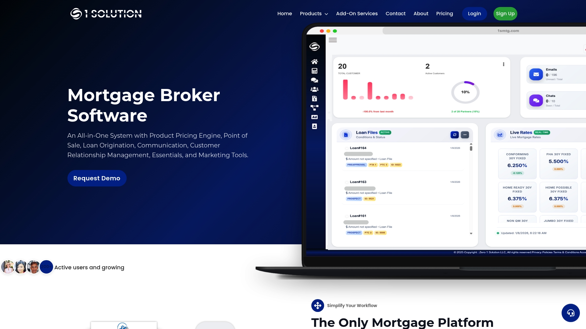
- One data layer means funded loans, pull-through, and cost per loan always match across every view.
- Scheduled exports and stalled-file alerts run automatically instead of requiring manual pulls.
- Some platforms are built around broker needs rather than investor priorities.
See how the platform fits your team at 1smtg.
Sources
- Fannie Mae research: impacts of digitization and production cost drivers
- MBA reporting: 2022 IMB production profits fall to series low
FAQ
What KPIs should my dashboard track?
At minimum, track funded loans, funded volume, applications, pull-through rate, average days to close, cost per loan, pipeline by stage, and loans per LO. Check pipeline stage and stalled files daily, applications and pull-through weekly, and funded volume, cost per loan, and productivity monthly.
How much does a loan officer make on a $500,000 loan?
Compensation varies widely by company, commission structure, and loan officer agreement, and no single public figure applies across the industry. It depends on the compensation plan in place, so check your own agreement or company pay schedule for the exact structure.
What is the 3-7-3 rule for a mortgage?
Definitions vary across the industry, and no single benchmark source in this article confirms a standardized "3-7-3 rule." Loan officers should confirm any such rule against current regulatory guidance rather than relying on informal industry shorthand.
What are metrics in a dashboard?
Metrics are the specific, defined data points a dashboard tracks, like funded loans or days to close, each with a clear formula and time window. A good dashboard pairs every metric with a precise definition so two people looking at the same tile always mean the same thing.
How often should loan officer dashboard metrics be reviewed?
Pipeline health and stalled files deserve a daily look, while application flow and pull-through rate work well on a weekly cadence. Funded volume, cost per loan, and productivity benchmarks like loans per LO are best reviewed monthly or year-to-date, since shorter windows tend to reflect market noise more than actual performance changes.